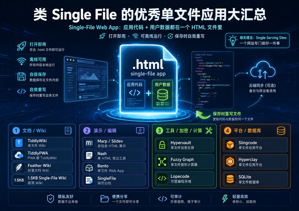
最近发生的两件事情让出版业深受震动。第一,被很多人认为是记录美国的报纸《纽约时报》(The New York Times)宣布,将放弃在线免费提供内容的业务,并从2011年开始,向长期读者收费;第二,苹果电脑公司(Apple)大肆宣传的平板电脑—— iPad——闪亮登场。《纽约时报》的决策对报纸出版商和其他免费内容提供商来说意味着什么呢?iPad将如何为图书重新定义呢,它又如何制作、营销以及传送呢?沃顿商学院市场营销学教授、“沃顿互动媒体计划”(Wharton Interactive Media Initiative)的联席主任彼得•费德(Peter S. Fader),以及沃顿商学院管理学教授、沃顿商学院出版社(Wharton School Publishing)的编辑史蒂芬•科布林(Stephen J. Kobrin)对这些新事物将会如何重塑出版业进行了探讨。
以下内容即为编辑后的对沃顿商学院管理学教授、沃顿商学院出版社编辑史蒂芬•科布林访谈(对沃顿商学院市场营销学教授、“沃顿互动媒体计划”的联席主任彼得•费德的访谈内容,请参见付费内容vs.免费内容:出版业的重塑):
今天我们请沃顿商学院出版社的编辑史蒂芬•科布林来谈谈电子出版界出现的新事物:《纽约时报》宣布,从2011年开始,它将向那些频频登录网站的读者收费;此外,苹果电脑公司将人们期待已久的平板电脑iPad高调推出。感谢接受我们的访谈,史蒂芬。
史蒂芬•科布林:谢谢。
这两个事件都会对出版界的收入创造模式和分销模式产生重大的影响。我们先从《纽约时报》的付费谈起吧,大幕有望在2011年年初开启。公司并没有披露多少这个计划的细节,但是,公司称,偶然阅读《纽约时报》的读者依然可以免费阅读。而经常消费的读者则需付费。这些读者要付多少费、他们怎么付费,以及需要付费的门槛是什么都尚不清楚。虽然这个公告一年以后才生效,不过,在你看来,人们是愿意一次性付费订阅《纽约时报》的在线内容呢,还是更愿意采用小额付费的方式订阅呢?
科布林:这是两个问题,一个是小额付费,一个是订阅。我先来谈谈小额付费。如果我们能推出减少付费困难的付费手段,也就是比把信用卡交给对方更容易的手段,那么,我想,人们就会采用为内容小额付费的方式。比如,如果我们找到一种只是点击鼠标就能付费的方法,就像在iTunes商店那样,很快就能支付75美分、1美元或者任何数额,那么,这种模式就能很好地运作。不过,读者一次付费可能不只阅读一篇文章。
接下来,我们谈谈订阅的问题,我想,这种模式无疑能良好地运作。《华尔街日报》的网站就是一个订阅网站,看起来,它的运作状况良好。随着人们转向在线内容消费,随着人们从印刷报纸转向自己感兴趣的内容,也就是当人们主要是在线消费时,他们将会愿意为此付费的。
如果《纽约时报》的模式取得了成功,那么,你认为,这种模式也适用于规模更小的地区性报纸和地方报纸吗?它们有足够多的对这类新闻感兴趣的读者来支撑报纸传送产品所需的成本吗?
科布林:问题在于,最近10年或者20年以来,阅读大城市日报的读者已经显著减少了。所以,这个问题有两个方面。第一,有足够多的人有兴趣阅读大城市的报纸吗?第二,在这些人中间,愿意付费获取在线信息的人占多大比例呢?
所以,这种模式是否有效其实是个读者规模的问题。
科布林:确实如此。在这种情况下,一种城市在线报纸可能会浮出水面,它与我们见过的任何报纸都不同,而且可能是一种现在还不存在的报纸。它不会是《费城问询者报》(The Philadelphia Inquirer)那样的报纸,而可能是当地新闻的源头,人们愿意为获取这些新闻付费,特别值得一提的是,它可能会有一些相当于分类信息、社会公告那样的内容。
对出版商来说,另一个收入模式可能会出自苹果公司被人们说的天花乱坠的iPad这类产品。在产品还没有推出的时候,iPad就被人们热议成是自《十戒的故事》以后最重要的阅读工具,是报纸、杂志和图书出版业的大救星。现在,它已经出来了。从你看到的情况来看,你认为,人们是否言过其实了呢?
科布林:我认为,还没有什么东西能达到人们所说的那种程度。有趣的是,那些天花乱坠的东西并不是来自苹果公司,而是由公司以外的人,也就是非常喜欢这款平板电脑的人编造的。从历史上来看,这个产品的发布是费气力很少的最佳市场营销活动之一。虽然我不知道这个产品是否有那么神奇,不过,我认为,类似于这款平板电脑一类的产品确实会彻底改变出版业。虽然亚马逊(Amazon)的Kindle电子阅读器和索尼公司(Sony)的Reader 电子阅读器,都是随身携带图书的绝妙设备,但是,从根本上来说,它们给人们带来的是与阅读纸质图书相同的体验。人们读到的依然是单调的图书,看到的也还是印刷的文字。当然,你可以在这些设备上进行某些操作,比如,调整字体的大小等,你可以用很少的空间携带很多图书,但是,使用它们的体验与阅读纸质图书并没有多大差别。
苹果公司的平板电脑则能让图书承载不同的功能。第一,如果图书以电子化方式出版,那么,我们不知道每本书是不是还需要有350页或者400页。第二,平板电脑要想取得成功,它就必须要有生动的内容。很多人之所以想在平板电脑上阅读《战争与和平》(War and Peace),就是因为纸质图书上印刷的文字已经被限制死了(无法调整)。当图书开始容纳视频内容和图像内容的时候,平板电脑就能彰显其价值了。举例来说,商业图书中的电子数据表、模型和图表就可以是激活状态了。
你的意思是说,要有一个互动要素,让你可以调取你正在学习的某些课程,并把它们“嵌入”到一个电子数据表中。
科布林:你可以利用一个电子数据表来阐明一个模型或者一个设想,你可以利用图像来说明另类的情境,你还可以嵌入视频内容。至关重要的是,要能为图书增加真正的价值,如果只是好玩,只是游戏,那么,它很快就会淡出的。它的内容一定要能为阅读体验增加价值,而不能只是利用平板电脑的优势添加一些附加软件。
不难理解的是,出版商会对与苹果公司iTunes商店类似的分销模式和收入模式保持警惕,在那种模式中,苹果公司以中间人的身份将自己安插在了音乐产业和消费者之间。你认为,会出现某些让所有人都感到满意的模式吗?
科布林:音乐产业和出版业有很大的差异。你用iPod听音乐,与一天快要结束的时候在家里用胶木唱片听音乐没有什么差别。音乐都能播放出来,你倾听音乐、投入音乐情境的方式也并无二致。不过,在电脑上阅读一本书的情形则有很大的差异。如果平板电脑能取得成功,那么,它带给你的将会是不同的体验。如果只是复制印刷的图书,它就解决不了体验的问题,也没有给人们带来多少新东西。在我们弄清“图书”在平板电脑上会是什么样子之前,我们很难想象商业模式将会怎样。举例来说,我们可能会发现,出现了很多篇幅更少的图书,可能会有很多虽然销量很小但依然能盈利的图书。将来会有各种可能性。所以说,在不知道图书会是什么样子之前,我们很难探讨商业模式的问题。
也就是说图书将来是什么样子我们尚一无所知。
科布林:是的。
我们已经有几项技术可以应用了。
科布林:就目前来说,你买一本书最重要的理由是,你在书店看到了它。人们也会从亚马逊买书,不过,他们之所以买那些书,是因为他们的朋友和他们谈起过。但是,买书最重要的因素依然是你在书店看到了它们。如果分销走向电子化,那么,我们如何让人们了解一本书、如何将读者引向一本书,以及如何帮助读者弄清有这样一本书就是一个真正的问题了。这会成为一个重大问题的。你怎么取代实体书店这个具体的分销渠道呢,你怎么用虚拟的在线方式,让读者像走进实体书店那样了解一本书呢?
不过,另一种由亚马逊首创的分销模式是,根据以往的购买记录,让老主顾知道他们可能会感兴趣的某些在售图书的书名。
科布林:去年,因为亚马逊让你知道了某些在售图书的书名而买了多少书呢?
可能在他们告诉的50本或者60本书中买了一本吧。
科布林:从某种程度上来说,你的经历就回答了这个问题。我不敢肯定这是不是一种非常有效的市场营销技巧。但是我想,这种模式将来会发展成——而且一定会发展成——能让人们浏览图书内容的全新形式的。举例来说,亚马逊会让你阅读一本书的一个章节,他们会让你看到书里的内容。Kindle 电子阅读器一个很有意思的特点是,通常情况下,你在购买任何一本书之前,可以先行下载该书的第一章。这种方式能让你对该书的内容、作者的风格等环节有所了解,之后,你就可以点击“购买”了。这种方式非常有效。同样,问题在于,我们怎么才能让人们下载第一章呢?还有,我们怎么才能让读者看到图书或者看到书中的内容呢?当有无数本图书在线销售时,知会读者就是个问题了。
如果我们要为未来构建一种商业模式,它能让我们在内容附加值——其中包括图像和视频内容——方面为图书重新定义,那么,这种模式就会使图书的制作过程变得复杂得多。单单是这一点就会改变出版业。你认为,现在已经有能处理这个过程的基础设施了吗?
科布林:我想,这样的基础设施会出现的。我不知道它现在发展到什么程度了。不过,这是一个“此消彼长”的问题。主要工作并没有变,你依然要以能激发读者兴趣、能传递信息的方式来制作一本书,图书依然要流畅、易读。有些新附件——比如,图像、视频等等——的成本会很高。不过,作为交换,你无需再印制纸质图书了,可能也无需通过实体书店来分销图书了。而后者则是花费不菲而且颇为耗时的环节。
就图书来说,我们不会看到报纸采用的那种免费模式出现的,是吧?
科布林:我想不会的。
摘自:http://www.ebusinessreview.cn/c/articlesingle-layoutId-52-id-5847.html
- 这是自己选手机的时候没事写给自己的,欢迎建设性评论,文革式大字报评论凡见必删
- 本文是开源文章.:) 好的评论我会加到正文里去,大家一起写吧
兄弟最近相当纠结,在选择下一部手机的问题上,基本的选择有两个:Nokia E72、Google Nexus One。纠结在于:我真的觉得Nokia相当的好用,上手,能够给我使用手机时“心灵的宁静”;但是触摸屏手机最近一年大行其道,buzz words 满天飞,不玩触屏您都不好意思和别人打招呼……只是,我用起来还是觉得有点不那么对劲。
于是,在深圳一个寒冷的夜晚,我拿出 E72 原型机和那部 iPhone 3G 并排放着,开始进行我专业的分析,以我几年 Nokia 软件的经验和 Fake User Experience PM 的背景…
我曾经以为我是因为 Nokia 的用户界面和交互设计而觉得好用,但是我发现它的 X6 触摸手机和侧滑盖的 N86 (N97,感谢评论纠正)系列一直不是特别感冒。我也曾经觉得是因为实体全键盘和虚拟全键盘的差别,不过我昨晚发了点狠,使劲敲了一大堆文字,发现两边其实都有错误率。实体全键盘也不是完全无误的。
后来我发现差别在于 Nokia 直板手机和 iPhone 全触屏的交互设计哲学是很不同的,这个本质上的差异导致了用户(我)的体验的最终反应。
这个差别可以称作为:基于拇指的交互设计与手指趋向交互设计
壹:交互
操作:一个五向导航键 + 两个软键(左上角,右上角两个按键分别对应屏幕左下角和右下角的命令)
输入区:全键盘或数字键盘
注意,这里的核心在于这个五向的导航键,几乎所有操作都是通过这个导航键加上两个软键完成的,为什么这么设计呢?因为这样就可以用你的大拇指在 一个很小的区域内完成所有操作,极其方便(考虑下我们使用手机设备的方式,单手握住,四指在后,拇指在前).于是,很多的 Nokia 的设计指南都和这种人体工学设计相一致,比如确认用中键、设置里菜单里的高频项在上方。
这样,就可以解释为什么我钟意 Nokia 的直板手机但是对侧滑盖不是特别有感觉了。
BTW,日式手机应该也有这样的设计思路,我在顺电用过SHARP,一个强大的文字菜单系统,配上翻盖的大屏幕(日本的 3G 发达),据日本上班同事说, 日本人做地铁时间太长啦,也需要一个手扶着一个手玩手机
iPhone:手指驱动,这里的手指是五指并用啊
先看触屏上的交互:
- Long and short Taps (短按,长按。短按是选择或激活,Nokia 和 WM 的长按是出二级菜单,iPhone 主页下是调整程序位置)
- Dragging (拖放)
- Sliding,Swiping(滑动)
- Pinching and Expanding (捏,伸,怎么翻译啊?)这就是iPhone的专利多点触摸啦
- Double Tapping(双击)
触屏上的手势:
- Changing the screen orientation on the device from portrait to landscape as the device is rotated.
- Silencing an incoming call when the device orientation is changed from screen down (for example on a table) to screen up and back again.
- Changing application settings based on the ambient light conditions.
- Changing the orientation of a map based on the device’s compass orientation.
- Allowing movements such as device rotation to trigger an action.
- Triggering an action when the device comes in close proximity to the user’s hand or head
基本上,我觉得触屏的设计更出于一种互联网终端的考虑,Nokia 的非触屏设计更出于一个手机设备的考虑。
关于里面软件设计的不同,看来还要再分析一篇了。
虽然还是没有作下最终决定,但是至少,我知道了喜欢在哪里不习惯在哪里的本质原因,透过最初的感觉分析出来本质的原因。于是,接下来就是 prioritize自己的喜好和trade-off.而不会继续纠结。这是很重要的思考和工作方法。丰田最近出事故,开始想用脚垫不合适来搪塞,后来用油门卡住这种小概率事件做理由,最后才被揪出设计上没有刹车优先这一根本的原因。查出本质是一门很有用的学问啊
(Reference: Forum Nokia Library)
贰:2G 的任务
一个电话呢,最基本的(重要的?)就是电话该具备的功能,在 2G 时代就是打电话、通讯录、信息。
我觉得在这三方面 Nokia 应该是完胜,why?人家几十年龙头老大的资格不是白给的,是多少代人一点一点积累出来滴。
短信:
进入 NOKIA Messaging 的菜单:
- New message (新信息,最高频使用啦)
- Inbox (收件箱,次高频使用啦)
- My folders (这个本人用的不多,曾经在某个时期使用过,基本上是把某些短信存起来,比如信用卡啊什么的)
- Hotmail (这个是装了微软和 Nokia 合作的客户端后生成的)
- Drafts (这个是草稿,用于写了一半,有别的事情要先存起来的)
- Sent (发出的短信,为什么这个很重要呢?请参考电影《手机》)
- Outbox(待发的短信)
- Reports (报告)
iPhone 里面:
短信以对话方式出现,这个最早应该是 Palm Treo 的风格,不知道 Palm 有没有加版权。相比 Nokia,缺了 My folder(对我影响不大),缺了 Drafts(影响比较大),短信归类(inbox, sent, outbox)这个呢,对我影响不大,但是对韩国人似乎影响很大(早先看了一个报道说韩国有研究发现iPhone导致离婚率升高,因为这个短信设计不能方便的清理历史痕迹…)
在短信操作里面,iPhone 最不方便的是无法多选短信。基本上,如果都是有意义的短信也还好,问题是中国的垃圾短信实在太多啦,于是坐下来删短信成了我的一个嗜好。另外,Nokia 可以对短信排序(根据时间、发信人、主题、类型),回短信时可以插入图片,音频,视频,可以加入另外的收信人,这些都很方便。基本上,可以说的是,在短信操作上,正常人能想到用到的功能都在 Nokia 的左软键里面了。
这是有原因的。我在 2007 年和 Nokia 一起做项目期间,在深圳凯宾斯基酒店包下一间餐厅做 development camp,中间看到了他们的一本厚厚的设计文档,虽然属于机密,我还是得地主便利看了一下。里面列出了各种 use case,从发一条新短信给新联系人,到发新短信给现有联系人,每一种use case有一个编号,配上详细截屏做 UI FLOW,再根据每个 use case 对应 test case。其文档之精致,对用户分析之细致,令我和同事叹为观止,“心情久久无法平静”,对我的直接影响就是我关起门来重新写了一遍我的 spec。那几眼让我至今仍然记忆犹新。用我座位后方一位词语较为匮乏的开发工程师回到办公室后的感叹形容,就是:Nokia 的文档,靠,太 TMD 爽了….话糙理不糙.
苹果的 iPhone 在短信上的进步是很快的,比如复制某条短信,比如把一个发件人或短信中出现的数字添加至联系人信息或保存为新联系人,但是整体比较还是差了 Nokia 一截。这是一个积累的问题,就像 Nokia 在 Ovi Store 上面距离 App Store 的差距一样。
(补:我上面说的不精确,iPhone不能像Nokia那样multiple select SMS,它的短信以contact为主轴. 感谢viumden评论:
iPhone删短信问题,iPhone的短信按联系人的号码来组织,同一个联系人可能有多个号码,同一个号码的所有交互短信会存储在一个对话下。进入短信界面后是所有对话的列表,你可以在一个对话上右滑点删除删掉整个对话,或者点右上角的编辑按钮进入所有对话选择删除界面,每个对话前会出现红色图标,点一 个删一个。又或者你可以进入一个对话,再点右上角的编辑按钮,然后点选对话里每一条信息前面的圆圈选中要删的短信,然后点下面的删除按钮一次删除。一切简洁而明了。
除此之外,联系人的设计也堪称完美。就不写了。BTW,联系人是 Nokia 系统的重中之重。这是和他们工作几年慢慢了解到的。
叁:3G的任务: 互联网
基本上,说起 Nokia 好用的地方,似乎到前面就把核心的说完了,到了移动互联网,哦,这是苹果的世界….
说起用手机上网,我用过 WM 的 Pocket IE, Opera Mini, Nokia Symbian 的浏览器,S40 的原生浏览器,UCWeb, 日本的 netfront, iPhone 的 safari。效果比较好的就是 UCWeb, Symbian 浏览器和 iPhone 的浏览器啦。
在浏览器的世界,好像 Nokia 传统的基于拇指设计不怎么灵了,手指的缩放,点击,可触摸的大屏幕好像更灵。想想之前没有触屏时 Symbian 浏览器长按导航键会出现一个小鼠标,觉得很不错,现在有了触摸设计就从根本上就超过了导航键。
肆:更多的任务
游戏:毫无疑问 iPhone 这种天生的超级终端设备占先 (不过我不怎么玩手机游戏,so far)
视频:应该是 iPhone 占先,不过 X6 好像也不错,这个基本就是比赛硬件,没什么设计的东东
GPS: Ovi Maps 全球免费,很是吸引人啊,不过据说搜索质量不好。iPhone 的 google maps 没有语音提示。我估计目前体验最好的是 Nexus One 上面的 google maps navigation
(以下为“合金枪头”评论,非常好。我和朋友用E72的Ovi在国外旅游,的确很方便(虽然据朋友讲搜索功能不如google map),当时没有用离线,用掉800多块
关于导航和地图方面,略有补充。恰好我的“下一部手机到底买不买,买什么”的纠结随着一个多月前全球全免费的Ovi Maps的出现而烟消云散了。毫不犹豫的在Amazon上面买了一部5800 XM,原因无它,就是还算便宜。
苹果没有官方的导航软件,只有在App store里面星罗棋布的一些玩具类应用;Google的导航软件基于它自己采集的Street view数据,所以目前支持的区域也很有限。更重要的是,无论Apple还是Google,他们的导航应用都不能离线使用,这在一个移动互联网尚未发展到 质量足够高,带宽足够大,稳定性足够强,而且价格足够低的阶段实在是一个劣势。相比而言,还是能够完全离线工作的Ovi Maps在目前这个时代更实用一些。这也算是Nokia在收购了NAVTEQ之后应该走的一步。
Google的理念是一切应用都可以基于他所吞下的整个互联网的数据来实现。这在固定设备领域已经能够逐渐推开。但在移动终端领域,这个目标的实现 受制于相关基础设施的更新建设,受制于运营商们为了重新划分领地的利益博弈。这个过程很复杂,恐怕不会在短期之内能够完成.)
伍:吾
刚才和同事(都是做过 Nokia 产品且有 iPhone 使用经验的)聊这个话题,大家都是觉得迄今未曾发现一部能兼备传统电话功能易用性和上网浏览移动互联 易用性为一体的手机. 当无法改变外界时,就需要认识自身来看自己的真正需要。
因此,最关键的,还是要研究用户本人(我)的需要。基本上,我是需要一个手机加笔电的组合。有一种说法,在移动互联网时代,上网的主设备为手机,辅助设备为电脑。
人最难认识的是自己。这也包含自己对一部设备的需求。
Nokia,拥有我所熟悉的东西。Nexus One,作为一部“when web meets phone”的产物,拥有我不熟悉的东西。
知已知,知未知,这是一个选择。
Pack
作为本公司员工,不打 Service Pack 实在不像话…呵呵,没有啦,每家软件公司都打 pack 的,只不过树大太招风而已…
虚拟键盘与实体键盘:
我本能上还是喜欢实体键盘,因为更安心,更舒服,更放心(别想歪了…)
看看区别吧。其实这个实体键盘的键的颗粒论面积其实是小于虚拟键盘的(我感觉),但是为什么误击率低呢,因为每个键粒设计为凸起,如果放错,能够实际的感 觉到并换位,然后确定好 后再按下算是输入,这种交互是和 PC 键盘一致,因此更安心放心。iPhone 触摸屏也可以改,但是每个键都是平的,手指移动起来是靠一个键的放大进行提示,然后抬起手指算是确定输入,这与一直以来物理键盘的交互是相反的。因此用起来(目前)我还不习惯。
但 iPhone 的虚拟键盘也有无法取代的优势,就像乔帮主在 iPhone 发布那天说其它手机键盘的问题是:它们固定在那儿,发售以后就无法改动。我发现虚拟键盘的优点是,他们可以不停的变!从数字键盘到全键盘到标点,按住某个字母还能伸出一堆相似的欧洲字符。WOW…. 这是一个很大的优点,物理键盘是靠组合键完成标点等的输入的。
目前,Blackberry 的 Storm 似乎能够让虚拟键盘有机械按键的感觉,我在商店里使用的时候居然发现有很机械的按键感,完全不同于三星那种触屏反馈的虚假感,今天查资料才知道原来在那个触屏下有着十足的机械按键设计。Holy Cow…怎不让机械全键盘的爱用者不内牛满面,ShiNiao不及啊….
移动互联网
到底什么是移动互联网?
- 通过手机浏览网页 (browser)。 这方面没觉得 Nokia 这些手机厂商有多大差距,除了 iPhone 的 touch 设计使上网体验增强外
- 通过手机访问互联网服务,比如 twitter,facebook 等等. 单独看这些功能,Nokia 这些公司似乎差距也不大
- 通过 App Store 和 iTunes 把云的内容提供商和内 容消费者,把应用程序提供商和应用程序消费者联成一个生态圈,移动互联不单指的是用户用移动设备消费互联网,指的也是生产、消费、运营的移动互联模式。如果移动互联指的是这个大系统,那是比较靠谱的,Apple 之外的厂商现在的确差距很大。但是在这个模式下,最终消费者消费的内容不一定和互联网有关系(比如单机游戏,音乐)
我觉得似乎现在媒体把 Nokia 的问题看成触屏手机的缺乏,这个好像不对,apple 的 App Store模式,itunes 模式是关键,如果看本质的话触屏这种体验要和这个模式本身分开(当然最终的成功是因为设备+软件+服务,触摸是设备和软件的一个卖点).
84% of Americans currently own a mobile phone. Sadly, there are no figures showing how many of these devices are ageing bricks without internet capabilities, but you can bet that, within a few years, the majority of mobile phone users will be able to browse the internet, wherever they are.
Right now, most websites are completely unsuitable for mobile viewing, taking 60 or more seconds to load and looking jumbled and confused as they’re squashed onto smaller screens.
Every day, however, thousands of people are releasing mobile versions of their websites and seeing greatly increased levels of traffic as a result. Unless you optimize your website for mobile phone users soon, you could be left behind by the competition. Creating a mobile-friendly version of your site sounds like a daunting task, but it couldn’t be easier to do. Using one of the excellent tools below, you’ll be able to build, host and launch your mobile site with absolutely no coding knowledge whatsoever.
1. MoFuse (from $7.95 per month)
MoFuse is one of the most popular mobile website builders around, which is unsurprising considering its excellent customizability. Visit the MoFuse website, click “Launch a New Mobile Site”, choose a mobile domain and insert your URL. Next, click on “Add Elements” to add dynamic and static content to each page. Click on “Layout” to transfer elements to your live site, dragging and dropping them to create the optimal visual arrangement before, finally, previewing your new site using MoFuse’s emulator, which brings up a mobile phone screen on your computer’s monitor. For bloggers, MoFuse is completely free and even easier to set up.
2. Mippin (free)
Mippin is an absolutely fantastic tool for those who want to mobilize an RSS-driven site. It doesn’t offer the same level of customization as MoFuse, but it’s much quicker to use and the results look great, every time. What’s more, your site will be optimized to work on over 2,000 handsets and the service is completely free. It provides users with basic analytics in reports, as well as the ability to earn money through mobile advertising.
3. Mobilize by Mippin (free)
Mobilize by Mippin is a terrific WordPress plugin, which automatically displays your blog to mobile visitors from your normal URL. Once installed, everybody accessing your site from a mobile phone will be automatically redirected to the mobile version. Photos are scaled to fit the horizontal dimensions of a phone screen and videos are converted to the 3GP format, commonly used on most 3G, 2G and even 4G phones.
4. Wirenode (free basic package)
At last count, 31,912 websites had been optimized for mobile phones using Wirenode, a tool which lacks the customization potential of MoFuse, but offers slightly more in this regard than Mippin. From Wirenode’s dashboard, users can configure their domain name, upload pictures, track visitors and page views and preview their site on an emulated phone. Wirenode’s simple Editor interface lets users personalize their mobile site with colors and images, and create, edit, rearrange and delete individual pages.
5. 2ergo (contact for a quote)
2ergo has mobilized huge organizations like Rightmove and The National Guard, creating mobile-friendly websites for them which look great and load quickly. 2ergo’s customers can choose to use the self-service mobile publishing and content management tool, Mobile Site Builder, or let 2ergo design a custom site especially for them. The latter, obviously, is the more expensive option of the two. 2ergo’s service includes automatic device and carrier detection, data capture and collection forms, an integrated ad service platform, real-time tracking and top-notch technical support.
6. Zinadoo (free)
Zinadoo is a really slick, free tool, which lets users build a mobile site quickly and easily. Users can make the most of Zinadoo’s web and mobile widgets, as well as its text and email services, to promote their site to an online and offline community. Furthermore, they can optimize their site for Google Mobile with keywords and tags, and upload videos using Zinadoo’s Mobile Video. As if that wasn’t enough, users can also gain access to Zinadoo’s online Business Directory and Mobiseer, a Web 2.0 service for organizing, tagging, sharing and managing favorite mobile sites.
7. Winksite (free)
Winksite is an excellent W3C mobileOK and .mobi standards-compliant mobile website builder which focuses heavily on the community element of website promotion and social interaction. It’s packed full of mobile-community-type features like forums, chat and polls. Users can use Winksite to create their own mobile portal for communicating with friends, sharing feeds and favorites. Users can also divert all of their texts, emails and Twitter messages to one mobile destination which people can interact with.
8. MobiSiteGalore (free)
MobiSiteGalore offers a mobile website builder, which can be used just as easily from a mobile phone as a computer. Its Quick Start Wizard, accompanied throughout by Help Movies, makes setting up a mobile website incredibly easy. Once you’ve added pages, chosen a color scheme, added content and checked your new site for compliance with ready.mobi standards, you can add items to your new site from the Goodies List. Goodies include click-to-call, add to phone book, Google search and links to PayPal.
9. mobiReady (free)
You can’t build a mobile site using mobiReady. What you can do, however, is test your existing site for mobile usability. Enter your URL and press “Go” to get free reports, detailing how well your site displays on mobiles and any potential problem areas. You’re even given information regarding how much people in different parts of the world are charged to view your site.
10. Google Mobile Optimizer (free)
Google Mobile Optimizer is the quickest possible means of transforming your website into one suitable for mobile user consumption. Navigate your way to google.com/gwt/n, enter a site URL and a lightweight version will appear, without headers, ads or images. It’s completely un-customizable and renders a minority of websites useless, but it’s a very useful bookmark for your phone.
Your Turn To Talk
I hope you liked this post! I’m curious to know which tools you use to create mobiles versions of your sites? What do you use for client’s sites? Please take a minute to chime in and let us know
摘自:http://spyrestudios.com/10-great-tools-to-create-a-mobile-version-of-your-site/

当我们成长到现在,有谁记得自己现在认识了多少人?经常联系多少人?通过电话、手机、Email等联系方式联系的人有多少?估计是一头雾水,甚至会为此而觉得麻烦。今天所介绍的网站Etacts.com就希望帮助你解决这方面的管理——管理好自己的联系人,打造你的人际关系通信门户(your relationship-centered communications portal)。
网站名称:Etacts.com(https://www.etacts.com/)
上线时间:2009年10月
网站地点:美国加州(Palo Alto, CA)
Etacts网站作为初创型的项目,得到美国Y-Combinator的支持。而其创意的来源就是当前人们在现实和网络中不断增加的人际关系网络,无论是你的家人、朋友、同事等联系人,还是电话、手机、Email、IM、SNS等联系方式上的人,都是一个很大的管理难题。Etacts希望通过自己的一套管理平台帮助用户更好地管理自己的联系人。
Etacts平台具有四类应用:一是与联系人的联系状况(Stay in Touch),Etacts能通过图表的方式展示你与每个人联系了多少次数、多长时间及具体的时间(包括Email、电话等方式),当然联系人的数据库需要你自己录入或者导入,通过Etacts你还可以设置自动提醒,比如多少天后、通过什么方式提醒你、与谁联系之类的;二是你的Email回应管理(Track Email Responses),Etacts会告诉你哪些人没有回应你的邮件、帮助你发现你没有回应的重要人的邮件等;三是会谈时间管理(Conversation Logging),Etacts会记录你每个电话的维持时间、发送Email或短信的时间等信息;四是群发信息管理(Mass messaging),Etacts可以帮助你快速地、个人化地群发邮件或短信。
当然目前Etacts应用服务距离自己所设想的还没有完全做到,目前仅支持Gmail和Google apps(谷歌应用),对于各类运营商的电话、手机等通信工具,甚至更长远的Facebook、Twitter、IM等工具尚未涉足,不过Etacts的志向和思路还是很远大的。
对于Etacts的服务,最大的挑战就是隐私和获取用户信任了,毕竟这些联系方式非常具有隐私性,如果被泄露或者买卖,后果不堪设想,Etacts 如何通过安全可信的服务,真正让用户来使用自己的服务,挑战不小。
摘自:http://tech.163.com/10/0226/09/60EICUUN000915BF.html
我相信,当史蒂夫·乔布斯向他的员工和某些媒体记者呛声Flash时,他确是言为心声——苹果的iPhone,iPod touch和iPad都旗帜鲜明地拒绝采用Flash这一多媒体平台。乔布斯对于简洁和优雅情有独钟,他很可能像《连线》和硅谷八卦网站 Valleywag等媒体的匿名消息源所称,相信Flash有“软件BUG”,是“CPU上的赘肉”(CPU hog),“充满安全漏洞”,是一项“垂死的技术”,导致大部分Mac崩溃,而对这些问题都要归咎于“懒惰”的Adobe工程师们。
但是 Flash提供了约75%的网络视频,并提供MPEG-4/H.264的高清视频格式,这绝不像乔布斯所说,是“平凡”的,而且我怀疑乔布斯本人也清楚这一点。而且使用Flash也不一定会像传言中乔布斯声称的那样,将iPad号称10小时的电池使用寿命减少到1.5小时。
乔布斯憎恶 Flash,必然还有其它的原因——商业原因。
《华尔街日报》编辑霍尔曼·詹金斯(Holman Jenkins)曾指出:“Flash也允许iPhone和iPad的用户无需经过iTunes就能消费视频和其它娱乐产品。Flash能让用户免费获得目前只能在苹果的App Store获得的各种性能。”
但是苹果主要通过出售硬件盈利,而不是99美分的软件产品。据互联网视频服务提供商 Brightcove的CEO杰里米·阿莱尔(Jeremy Allaire)认为,这其实是互联网的主导平台公司——苹果、Adobe、Google和微软之间一场争夺权利和控制力的战争。
在为科技博客TechCeunch的撰文中,阿莱尔写道:“这些公司都在寻求创造独特的运行库和API,从而为推动其它业务的发展提供战略契机。”他写道,“在某一层面上,这是独立软件开发商们智力和想法的较量,但是这些不过是达到目的的手段而已。他们的运行平台如果获得广泛采用,就能够转化为通过下游产品和服务创造大量衍生价值的能力。”
“对于苹果公司来说,这意味着硬件和付费媒体(内容和应用程序)的销售。对于Google来说,这意味着极大拓展广告平台和产品的接触范围。对于Adobe来说,这意味着可以通过他们的平台创建新的应用程序业务。对于微软来说,这意味着提升核心操作系统和商业应用程序的单位销售额。”
对于那些苹果观察家们来说,读了这些,就不难理解乔布斯对Flash的复杂情结了。
摘自:http://www.cnemag.com.cn/fenxplun/newsfx/2010-02-22/185821.shtml
Gowalla已经拿到了大笔投 资,My Town称自己网站的登记(check-in)次数比其它网站多,而Foursquare则由创始人(曾创建Dodgeball,后卖给Google)的 种子基金支持。Foursquare之所以实力雄厚主要原因有两点:
第一,支持所有手机平台,并且兼具游戏元素。第二,很早就明智地开放了自己的API,催生了一批新的次级应用。
此外,Foursquare有一个非常活跃的开发者社区。和Twitter一样,不仅仅是网站本身创造需求,网站上的应用也创造 需求。
定位 社交网站之所以非常流行是因为其易用性,无论何时何地,你都可以打开手机“登记”,获得积分,获得勋章。
下一步:用户为中心和地点为中 心
和一些其它早期社交网站平台一样,通过次级应用延伸网站让Foursquare变得非常有用。
目前,次级应用主要分为两大类:一类 是以用户为中心,如“哪儿去wheredoyougo”。这个网站可以把用户登记情况转化为可视化的热点图。另一家网站foursqpic允 许用户上传图片,成为Foursquare集合地点建议(Venue Tips)的一部分,用户也可以通过简单的文本建议进行补充。但是,最有潜力的是以地点为中心的应用。
目前最先进的一个应用就是placewidget,该应用允许一个地方 的业主们通过网站插件推选本地“市长”。
Foursquare目前宣布已经和两家媒体进行了合作,一家是加拿大最大的免费报纸Metro,根据地点提供新闻内容。另一家是 Bravo TV,包括500多个地方的Bravo 名人建议和Bravo徽章。
摘自:http://blog.it.sohu.com/readwriteweb/archives/7273
穆荣正驾车从上海赶往苏州的家中吃晚饭。此时,远在100公里以外的苏州家中,穆荣的家人正透过贝多移动社区观看他的行程直播。在社区的聊天列表中,穆荣的头像边上此时正显示着一个汽车图像,在接下来的一小时里,这个图像慢慢变为自行车、小人。当看到图像变为小人时,家人开始为他热菜了。5分钟后穆荣迈进家门时,迎接他的是饭菜飘香。
位置·社区
苏州贝多科技有限公司(下称“贝多”)是穆荣创立的公司,推出了国内第一家提供位置分享以及基于位置社交的移动社区,在2009年10月获得了高通公司的风险投资。这个移动社区融合了游戏、即时通信、交友、位置查询和定位等功能。在社区里,小人代表2公里内的好友,自行车是20公里内的好友,汽车则是20公里~500公里范围内的好友,飞机意味着距离在500公里~5,000公里的好友。穆荣并不是典型的用户,1,200多万18~28岁的中国年轻人正疯狂地使用贝多社区的位置服务。
移动定位是贝多的典型应用。贝多最近一个很受追捧的新应用是笔记本的防盗服务。当笔记本的位置移动和原来的线路不一样时,贝多的定位系统会提示当前的使用者输入密码,而在出现3次密码错误后,电脑就会调用摄像头记录下盗窃者的信息,并连同位置信息一起发送给失主,“你只要去逮人,就能找回自己的电脑”。
贝多糅合微博、开心网、游戏等多种形式。在这个大杂烩中,除了贝多积累多年的数据库外,单个的技术产品看似并无任何开发上的难点。穆荣则认为根据需求有效的叠加各种应用,正是创新之处。
不止是穆荣看到移动社区的爆发趋势。总部位于荷兰阿姆斯特、同样提供定位式移动社区服务的GyPSii公司2009年就在国内设立了分公司。该公司负责战略的副总裁Shane Lennon在接受《创业邦》记者采访时就表示,“许多兴奋的数据激励着我们来到中国,中国有全球发展最激进的市场。”让Shane兴奋的数据是,中国目前6.87亿手机用户中有1.55亿使用手机上网。相比之下,通信业高度发达的荷兰才1,600多万人口。
研究结构eMarketer估计,到2013年,全球移动用户中使用移动社区的比例将高达43%,人数则会突破6亿,移动社区的应用已经进入了一个快速增长的阶段。而来自产业界的观点也同样证实了这点。Nokia和Stratemerge公司于2009年1月份公布了报告《移动社交网络的消费者和技术趋势》,该报告显示:在美国和西欧进行的调查中,87%的人认为社交网络和电话本结合起来会非常有吸引力,79%的人认为愿意跟社交群体分享自己的即时信息。
商业模式定位
纵然是为用户提供精准有效的定位服务,但是贝多的有效商业模式实际上却处于“未定位”的待定状态。互联网领域中向用户收费和向广告客户收费两个方向,也是绝大部分移动互联网企业在探讨的收益渠道。在商业模式上,贝多也保持中规中矩,并无太多突破。
购买社区游戏道具、赠送虚拟礼品等是贝多从用户获得收益的主要方式。一些交友的定位增值服务也同样贡献了收入,比如用户设定了自己的交友喜好类型后,当其所在的一定范围内出现符合要求的人以后,贝多的定位软件会提醒“目标”出现,也就是配对服务。
在定位服务中,与位置相关的商家广告是贝多的另外一个收入渠道。不过,作为许多互联网企业最主要的盈利模式,并且被证明有效果的网络广告平移到移动社区时,却没有预期的表现效果。穆荣预测,未来1~2年,贝多向用户的收费仍将高于广告收入。移动社区中以低年龄、低学历、低收入为主要特征的用户群体,给广告主带来了广告传播质量上的极大担忧。而在移动网络中,消费者如何品牌互动等很多问题仍待解决。
这些问题同样困扰GyPSii公司,其副总裁Shane Lennon告诉本刊记者,GyPSii也是采用向客户和用户收费的“一前一后”模式。眼下,该公司也在探讨新的模式,GyPSii在2009年11月份成为了中国联通的合作伙伴,公司的定位服务软件将内置到联通代理的iPhone(手机上网)手机中,商业模式则是与联通进行收益分成。
穆荣也一直在寻找新的商业模式。2009年8月,他决定开放底层的定位数据平台,并命名为“驴博士”。不过,这个想法甫一提出,就在内部引爆了争议,多数员工担忧这样将导致公司的核心竞争优势丢掉,因为“驴博士”和贝多社区实际上是前后端的关系。穆荣则有更深的考量,他认为开放平台,将推动出现更多的定位服务应用。对于一个新生的领域,在看不到竞争对手的时候,挣人气显然更为重要。
在这个对外开放API接口“驴博士”定位平台上,由于降低了定位开发门槛,第三方公司可以在两个星期内开发出基于位置的应用,将缩短此前运营商主导下的定位产业链。为了快速推广“驴博士”,穆荣以免费为噱头,并采取了分段定价的策略。合作伙伴利用“驴博士”每天的定位次数不超过5,000次时可以免费使用,超过限额则须支付数据使用费或广告流量分成。眼下,包括手机搜索客户端、社交网站等很多第三方都在利用“驴博士”,该平台目前保持着每3天1个签约客户的速度。“培养了一些竞争对手,也推动了网络定位服务的发展,实际上是得大于失。”不过,在定位服务仍处于起步的阶段,在穆荣看来,腾讯的QQ将会是贝多等移动社区的榜样。
在国内各大运营商的规划中,相比手机游戏等快速带来收益的新应用,移动社区的发展优先级并不高,大都是放在未来的规划中。相对手机游戏等应用,移动社区仍未找到有效赢利模式,带给运营商的APRU值也是很低的。找不到把社区用户带来的大流量转化为更多的收入的方法,运营商也非常踌躇。
eMarketer最近的一份最新报告就提到了移动社区的一些关键问题,其中除了有限的广告以外,预算投入和定位精度的投资回报率不高也是关键问题。比如贝多的WIFI定位精度是在100米以内,这样的误差似乎也意味着移动社区更靠近用户的真正繁荣还需要时日。
摘自:http://tech.sina.com.cn/t/2010-02-10/11253851545.shtml
Apple has always been recognized for their products’ beautiful designs, and even for the design of their website, Apple.com. Take a look around the web, and you’ll notice tons of sites that are inspired from Apple’s design. In fact, I don’t even have to list them, as others have already done that.
But what exactly makes this such a great design? Let’s find out!
It’s Simple
A feature of the design of all of their products is the extreme simplicity. It’s part of their branding. Because it’s part of their branding, it applies to their website as well.
When you first get to the home page, you see that it really has the bare minimum. There is a main navigation bar, and below that is a giant picture of the iPad. If you scroll down, you’ll find a bit of information about some of their other products. But to avoid cluttering up the home page, you’ll have to click through to those products’ individual sections of the site.
They don’t even have a huge logo on their site. The only logo is the little icon in the navigation bar. However, it is still in a consistent location, the top left section of the page and at the beginning of the navigation bar, so users will know that clicking it will take them back to the home page.
It’s Well Organized
At Apple.com, everything is nice and organized, with everything where you expect it to be. If you’re looking for information about a specific product, you’ll be able to get to it from their main navigation bar, at the top of the site.
Once you venture one level deeper into the site, you’ll find another menu near the top, to narrow down what products you’re looking for information on even more. On every page, you’ll find the most important information at the top. If you want the less important details, simply scroll down and you’ll find them.
One thing I like about how it’s organized is the way that a grid is used. Sections that are less important can have up to five narrow columns, while the important stuff that they want you to pay attention to can take up three or even all five columns.
It’s Interactive
Not only is it interactive, it’s actually done well. In my opinion, it is best for all interactivity to be done subtly. For example, having some small change in an element on the page to let the user know that if they click it, something will happen.
The way interactivity is done on this website can really help usability. The navigation menu changes when hovered over, like how most websites do it, and that’s what the user can expect.
But Apple has gone a step further, having the background image change again to a special active state when the user click on one of the links. Most website do not do this, and this really a simple thing that most websites could do to add those extra details that really count.
And that leads me on to my next point…
Extreme Attention to Detail

The details can make or break a design. In web design, it is important to pay attention to the little details.
One example of the excellent attention to detail is this little button. At first, it just looks like a little button telling you to buy a MacBook Pro. But upon closer inspection, you can see all of the details that were put into such a simple button.
Most noticeable is the gradient background, giving a sense of depth. Another detail is a thin border around the button, with a subtle drop shadow. Another nice detail is the hover effect, and the active state of the button when clicked.
It’s Consistent
One thing that I love about Apple.com is the way that every page is consistent with the rest of the site.
Many times I go to some company’s website (*cough* Asus *cough*), and I’m greeted with a page with information to get me to buy their latest product. And then I head over to the “store” section of the site to buy it, to find a page that is completely different from the rest of the site, with entirely different colours and layout. Later, when I have a problem with the product I bought, I check out the “support” section of their site, and end up having to learn a new way to navigate through this part of the site.
But not with Apple. If I want to buy a laptop from them, I can simply go to the appropriate section of the site and easily figure out how to navigate it, based on my experience with the rest of the site. And then when I have a question, I can take a look at the “support” section of the site, and quickly figure out how to get support for my laptop.
What Could Be Improved
While the design of Apple’s website is very well done overall, there are always a few little things that could be improved.
-
All of the videos on the site are in Apple’s QuickTime. That’s a problem for me, because it doesn’t seem to be officially available for Linux. Maybe it’s just a secret plan to make everyone buy their software. But QuickTime is available for Windows, so…
-
Move the breadcrumb navigation closer to the top of the page. Users looking to go one or more levels up in the site would find this helpful, but right now it’s hidden down in the footer. Users looking for a breadcrumb trail will expect it to be in an area that is “above the fold”, like it is on just about every other website.
That’s really all that I noticed. But I’m sure I could find a couple more, if I was being very picky.
Conclusion
Apple really has a near-perfect website design, with just a couple of minor problems that could be improved.
What do you think of the design of Apple’s website? Do you love it, or do you think the style is overused? Be sure to leave your answer in the comments section of this post.
摘自:http://fwebde.com/web-design/apple-website-design/
Have you ever looked enviously at that friend of yours who has the cool new Android phone? Have you ever thought that you’d like to give it a whirl but you don’t want to spend the cash on a new phone until you have? Well now you can thanks to Live Android.
Live Android is a live-cd that can run under VirtualBox (and several other virtualization platforms) or even on your PC so you can test out the Android OS without having to buy a phone.
Here are some screenshots of it running in VirtualBox on our test machine:
And another:

You can grab a copy from: http://code.google.com/p/live-android/
摘自:http://www.linuxcritic.com/linux-bsd-distributions/google-android-os-buy-phone
As you may have read in one of my recent posts, I have become the owner of a brand new iPhone. This is the third Apple product that I have acquired (after my iPod Nano and MacBook), and there are some common elements that I have experienced with all of them. Obviously, there is the excellent design and craftsmanship. All three products feature beautiful lines and surfaces, and just generally lovely to look at. That is somewhat of a hallmark of Apple’s line of products!
iPhone Lessons and the User Experience
The other thing that was common to all three of the products was an exceptional user experience – specifically in terms of first contact. In this article, I would like to look at four lessons that I learned through my own initial experience with my new iPhone.
Before getting started, though, I would like to preface this discussion by stating that user experience (or UX as it is called) is an area in which I am still learning and growing. As such, I certainly don’t come at this subject with any claim at being an authoritative voice on the subject. Instead, I would simply like to share some of my own observations and outline what I feel that I’ve learned from them.
Attractive Packaging
Before ever even getting my hands on the iPhone (and beginning a never ending battle with fingerprints and smudges on its glassy black surface), my first contact was with the packaging itself. The box was small and compact, and a remarkable example of design in its own right! The top of the box featured an image of the iPhone itself, with the apps arranged to their default configuration.
The shape of the iPhone was also raised out of the smooth rigid cardboard, and printed with a shiny finish along the silver bevel. All of this radiated the simple promise of the device that was resting inside, waiting to be used and enjoyed.
All told, this first moment of contact with the product was extremely enjoyable (I will definitely be keeping that box). From this, I would suggest that, although simple packaging on its own will never be enough to establish a positive user experience, it’s certainly a good first step.
I think that this same premise can be translated into a lesson for designing all types of user experience. By wrapping the product in an attractive and enjoyable package (either physical or metaphorical), you can begin to establish the foundation for a positive user experience. Once the packaging is opened, however, it will always be up to the product itself to deliver that experience.
Uniformity of Brand
After opening the packaging, I obviously came face to face with the iPhone itself, resting in its simple, black plastic cradle. There were, however several other things also to be found in that little black box, including the instruction booklets, headphones, the USB cable and a nifty little adapter which turns that cable into an independent charging cord that plugs right into the wall.
All of these things were wonderfully familiar to me through my experience with other Apple products. I would like to consider each of them independently.
Instruction Booklets – All of the booklets were contained in a simple, black and matte-finished pouch. The pouch was extremely simple looking, with no real graphics beyond the words “Designed by Apple in California”, and a simple tab to help keep it closed. It was, however, almost identical in every way other than size to the pouch that had held the various instruction booklets for my MacBook. Immediately upon opening it, I felt a sense of familiarity with the Apple brand.
Earphones – I’ve never been a big fan of the earphones that Apple ships with it’s iPod line. But, then, I’ve never been a big fan of any kind of earphones. I’m much more partial to larger headphones that actually rest over top of my ears. That being said, the earphones that came with the iPhone were still familiar, and helped link it in with the rest of the product line.
USB Cable – This is also true of the USB cable, about which I was significantly more excited than I was with the earphones. The cable that came with the iPhone is identical to the one that came with my iPod over a year earlier, and my wife’s iPod several years before that. I’ve purposefully mixed and matched and found that all three of the cords are entirely interchangeable! Not only does this create still more uniformity across the product line, it’s also incredibly convenient for repeat customers (like myself). I can now leave one cord at the office, one by the home computer, and another one in my laptop bag, meaning that it should always be easy to plug the iPhone into my MacBook, no matter where I am!
USB Attachment – The USB attachment is a handy little device, which I was pretty stoked to find included with the iPhone. Having to charge a mobile device through a computer can be pretty frustrating when you’re on the go, and this attachment helps eliminate the problem! Additionally, though, it also reminds me a lot of the power cord for my MacBook, which has a similar, removable block, and allows me to attach it to a larger power cord for added length. Again, the appearance of this attachment reminded me of another Apple product, helping to establish uniformity across the brand!
The lesson learned here is the importance of branding in the user experience. For me, every purchase of an Apple product only emphasizes my understanding of their core brand values. Also given that I have had a positive experience with all of their products, I can thus be confident that any future purchases will also provide me with a similar (positive) experience!
It Just Works
One phrase that we’ve heard as recently as Steve Jobs’ much heralded revelation of the already infamous iPad is that “it just works”. This is equally true of the iPhone. I was able to simply turn it on and start using it. I pressed the home button and up popped the menu. I quickly located Safari (another form of brand uniformity), launched the app and started surfing the internet.
It really was that easy.
And so was setting up my email. I just plugged the iPhone into my MacBook and synced them up. Immediately, the mail app on my iPhone was configured and I was able to download and read my emails. All of the other apps worked the same way. As such, my immediate experience with the product (and my continuing experience so far) is that it just works. There’s no need to jump through hoops to get it to do what I want.
The lesson to be learned here is that a product should just do what it is designed to do. This, of course, would include a website. If your site is designed to have a specific functionality, making sure that it just works the way it’s supposed to is a relatively a elementary (though perhaps not always simple) way to help ensure a positive user experience!
Wonderful Simplicity
The iPhone is also wonderfully simple and intuitive to use. This is similar to the fact that it just works, but I categorize it somewhat differently because a product can work the way it’s designed to but still be more complex than is really necessary.
Not so with the iPhone. After turning it on, I was able to navigate through the apps easily – literally just with a flip and tap of my thumb. Various functionality, such as systems settings were easy to find and understand. After just a few hours I felt more than competent with the device. This all contributed to a positive experience on my part.
Compare this against my wife, who picked up a Blackberry at the same time as I got the iPhone. She actually really loves her new phone, so I am by no means suggesting that she had a negative user experience, but there was certainly a longer learning curve as she accustomed herself to using the device and navigating through the various menus and sub menus.
Fortunately the learning curve was not so steep as to turn her off of her new purchase, but there is a user experience lesson to be learned here too. Make the use of your product (or design) as simple as possible. Of course, you don’t want to sacrifice functionality, but making your interface simple and intuitive is another crucial step towards helping to ensure a positive experience for your users and/or customers.
Conclusion
Well there you have it. This is probably not the most scientific or academic way out outlining use experience, and is certainly not an exhaustive list of the areas that you need to consider when designing for user experience. Still, I hope that you can learn something from this article. At the very least, I hope that my experiences have helped to affirm some of the things that you may have already known on the subject.
As I mentioned, I’m far from an expert in user experience, so I’d love to hear your thoughts and comments on this one. Did any of you have a similar experience with your iPhones, or perhaps with a different product? Please feel free to leave a comment and share your thoughts and experiences!
http://blog.echoenduring.com/2010/02/09/iphone-lessons-and-the-user-experience/


